PENTAGRAM WORK FOR THE NATIONAL TAKES WRY LOOK AT CORPORATE BRANDING
Article here.
Sleep Well Beast is released by 4AD on September 8.
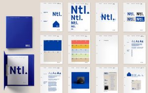
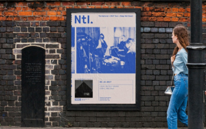
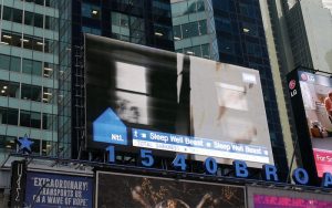
Article here.
Sleep Well Beast is released by 4AD on September 8.


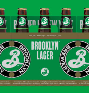
Brooklyn beats, BEER!
This is a story about how Milton Glaser took a chance on Brooklyn Brewery. Read it here.
Miami cannot be forgotten. There is South Beach and then there is Miami. Rich in culture. Here are recent visits to PAMM w/ works by Firelei Baez, Nari Ward and a stop at the increasingly famous, not to mention, crowded, Wynwood Walls (secret: still worth it).
Via Pantone : For the first time Pantone introduces two shades, Rose Quartz and Serenity as the PANTONE Color of the Year 2016. Rose Quartz is a persuasive yet gentle tone that conveys compassion and a sense of composure.
Serenity is weightless and airy, like the expanse of the blue sky above us, bringing feelings of respite and relaxation even in turbulent times.
When working in the creative arts, marketing, media industry, one major and extremely frustrating hurdle is dealing with clients who assume your spec work will be done at no cost until they see the final product. Toronto agency Zulu Alpha Kilo, brought to us by AdWeek, created this video to flip the script. When other business owners are presented with a proposal for free spec work on their end, the reactions are priceless. Creatives need to be paid for everything. It’s time to end spec work across the board!
Via Vice Sports and Indoek – Craig Stecyk is an artist, a writer, a filmmaker, a photographer, and by default a historian on everything that is cool about Southern California. Vice spent a day making posters with him and talking to a few of his friends about his life.
Came for a great buddies wedding and Hatch Show Print ending up being on the first floor of our building. Living, breathing art and printmaking an elevator ride away. Nashville, TN is an amazing place. GO!
Happy Monday. Fall is just around the corner. For my mother:
Typeface made of Trees (by way of Irish Artist Katie Holten and @fastcompany ).

Order here . Enjoy!
And the winner of the 2016 Presidential Election? Graphic Designers. The battle will be fought on Twitter. Whatever your view, at least both understand the power of visualization and design in delivering messages. We first have Hillary with a warning shot across the bow:
Jeb! with the return volley:
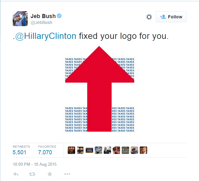 …and its only August 2015!
Penguin, Pelican and Puffin – A journey into Grafik Design evolution and admiration of Allen Lane:

“Traditional accounts of the story of Penguin’s logo usually from this point simply skip ahead to Jan Tschichold’s 1946 tidying-up of the logo before leaping head-first into talking about Angus Hyland’s slightly boggle-eyed 2003 update. But this misses the magic, eccentricity and contemporary relevance of the mark.”
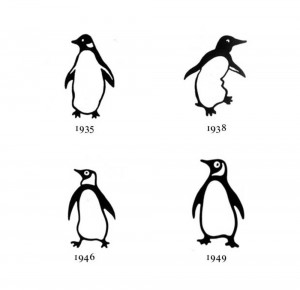
“While the penguin is approachable, the pelican is serious and confident and the puffin friendly and eager. This is a truly advanced logo (or series of logos): it is able to convey complex layers of information on both a semiotic and a highly functional level. It’s a logo where the form can be entirely changed and yet still be recognized as part of the overarching Penguin group.
With the original Pelican version of the logo, it’s particularly satisfying seeing the elegant bird in mid-flight on the cover and yet standing stationary and relaxed on the spine.”
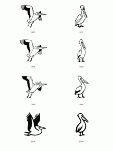
“Later in the nineteen-forties, when the children’s imprint Puffin was started by Lane, the answer was again the same: a puffin drawn similarly to the original penguin. Thinking in terms of the first three forms of Penguin books (Penguin, Pelican and Puffin), the Penguin logo can be seen as simply one iteration of a shaping-shifting logo, where the consistency is found in style of drawing, occasional use of an oval frame – and the image of a bird beginning with the letter ‘p’.”
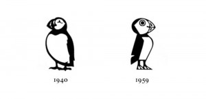
“It’s an easy thing to overlook, but it’s the sort of negligible detail that gives the design, both of book and logo, that little bit of something – a knowing smile, a wink, an in-joke – which sets it apart from the rest. In all which they turned their mind to, Lane and his series of talented designers did what had been done before, but with more imagination.”
Credit: